Latest news Spark Release
Smoothing
Selecting at least three contiguous cells the right click enables ‘Smoothing’ menu: if you select it, the smoothing algorithm is applied.
Graph with starting data:
Selection of “Smoothing” functionality
Graphic effect on the data:
Shortcut CTRL+L
Selecting a single cell and pressing ‘CTRL+L’ all cells of the row will be selected.
Configurable Live measures view
‘Live measures’ menu will show two additional items:
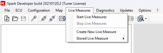
‘Create new Live measures’ lets you create templates of measures you can save and recall from the option ‘Stored live measure’. This function allows to create different templates to be used in different situations.
‘Stored live measures’ shows the list of all the previously created templates. This menu allows templates modification and deletion as well as activation of live measures.
Note that the ‘Tuner default” template cannot be modified.
When you select ‘Create new live measures’ option the corresponding window below is prompted. Here below is an example of use.
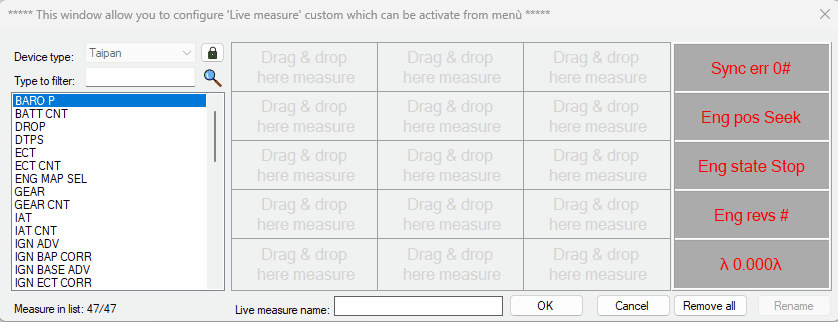
In ‘Device type’ drop down list the connected ECU will be proposed but pressing the padlock key (not available in modify mode) it will be possible to change it. Changing the ECU, the measures already placed in the grid will be deleted and measure list will be filled with these of the selected ECU. The last column on the right remains fixed for conformity with live measures window. Measures can be placed in the grid also double clicking them; in this case they will be placed sequentially by row starting from the first free cell.
‘Type to filter’ text box filters the measures according to the typed text.
The template can be saved after having selected at least one measure and having define a name in “Live measure name” box. After having created a new configuration the options “Activate”, “Modify” and “Delete” appear in the related drop-down menu.
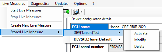
‘Activate’, is only active if the ECU is connected and it appears only for the compatible configurations; the configuration in object will be shown bold and live measures window will be replaced with the one selected.
‘Modifiy’ allows to modify measures sequence and the name of the configuration replacing the previous one.
‘Delete’ deletes the current configuration and it will not be possible to recover it.
All above described functionalities are only available for “tuner” user.
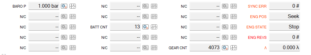
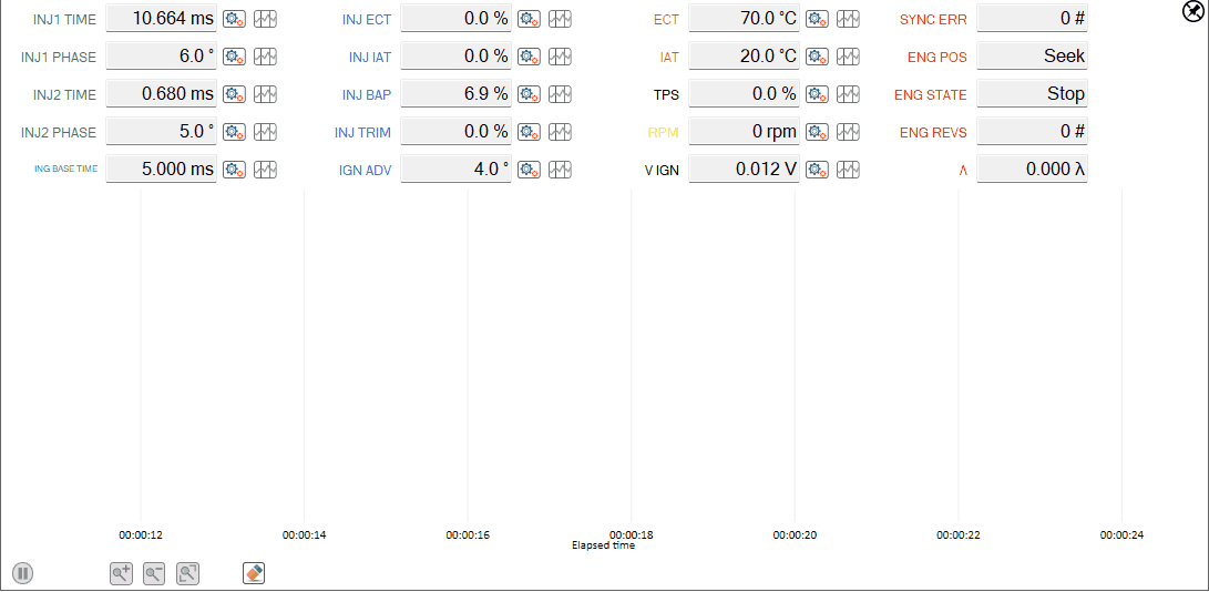
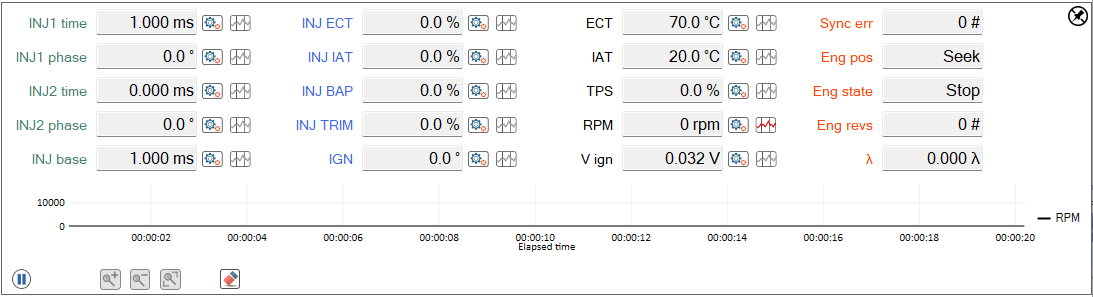
Live measures Setting and Plot
Setting button allows to modify color as well as min and max values of the graph “Y” axis concerning the selected measure. Using plot button, the name of the measure is shown in bold and underlined and the measure will be plotted in the same way.
What’s new
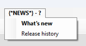
An additional menu has been introduced under the existing one “?”; it connects to “what’s new” page so to give an overview of the news concerning the new software just installed. The menu adds the text {News} before “?” menu and it will remain bold until the first time it is clicked. Once clicked, restarting the software it will return “?”.
Improved handshake ECU connection
Handshake for the identification of connected ECU has been speed up; unplugging and plugging in an ECU through the JST programming connector Spark answer is quicker.
Grouped bike list for same bike models
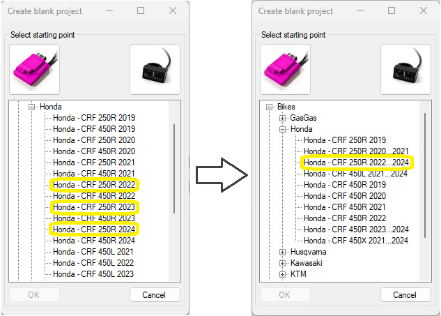
We grouped bikes with the same project reducing the number of items in the list and making the research easier. In the example above Honda CRF 250R from 2022 to 2024 were 3 items (left image) while now they are grouped in one item only (right image).
Pin/Unpin “Table 2D control” and “DAQ control”
All the functions described below have also been implemented for the control of 2D tables.
Unpin icon

Pressing this icon DAQ window unhooks from Spark main one allowing the user to replace and resize it as desired, saving all functions.
Pin icon

Once the window unhooked the icon switches to “Pin” icon indicating that if pressed DAQ window re-hooks to the main one.
Gauge Gear Calibration
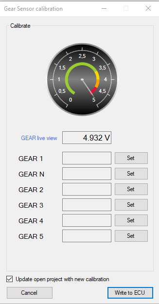
In gear calibration window a gauge has been added to give you an easier feedback about GEAR value (volt).
Interpolation on: row, column and bilinear
Linear interpolation row
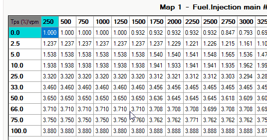
Selecting one or more rows of values, mouse right button enables “Linear interpolation row” menu item and values are interpolated according to horizontal breakpoints and selected columns.
Linear interpolation column
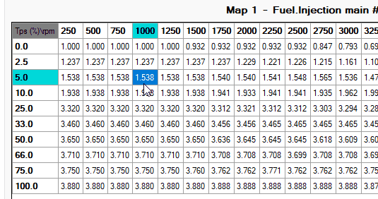
Selecting one or more columns of values, mouse right button enables “Linear interpolation column” menu item and values are interpolated according to vertical breakpoints corresponding to selected columns.
Bilinear interpolation
Selecting a range that includes rows and columns you can decide the desired interpolation to be made: for rows, for columns or bilinear.
Choosing bilinear option the software performs first an interpolation for rows, than for columns always taking into accounts the values of horizontal and vertical breakpoints.
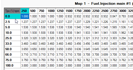
Edit table: add/add%/set and linearization horizontal/vertical/bidirectional
Selecting range value and pressing right mouse button on table, you can edit value with follow option:
Entering a value in the top-left cell allows for performing addition, addition percentage, or setting the individual value across all selected items in the table.
Entering a value in either the horizontal or vertical cell respectively enables choosing to perform addition, addition percentage or setting on linearized values of the selected items horizontally or vertically.
Entering values in all three cells allows for bidirectional addition, addition percentage or setting operations.
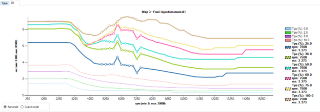
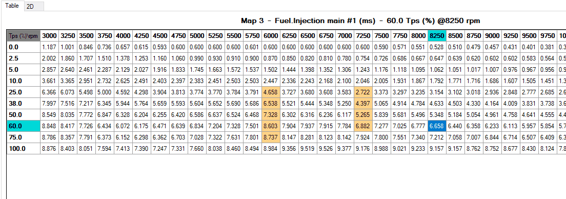
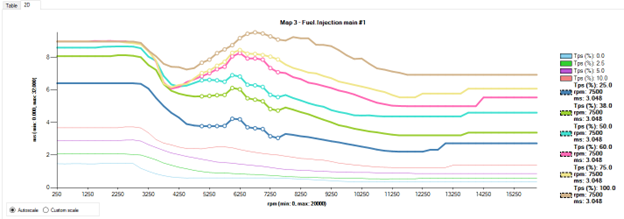
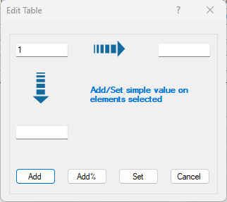
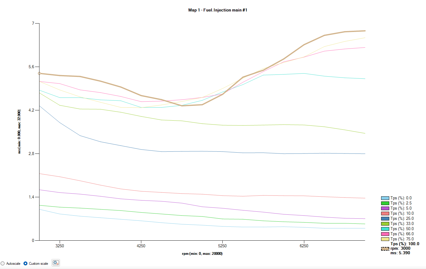
2D graph custom scale
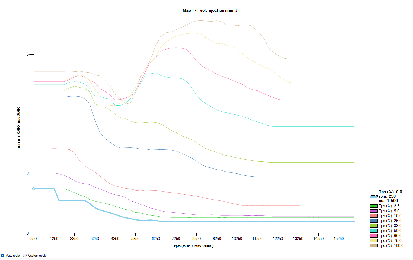
Was introduced a possibility to set custom scale on the graph through the option button positioned on the left bottom. This feature allow you to modify each point in details inside of an area of your interest. You can navigate from autoscale to custom scale and reverse, and when you are in custom scale the last setting saved will be restored. When you choose “Custom scale” will appear a setting button and if is the first time you are setupping nothing will happened till you set different value from default.
This form allow you to set each coordinate you want. Consider that the visualization will change on press OK and each time you come back on this graph the visualization will be custom. If you want to come back on autoscale have to select option button corrispondent. Follow an example of visualization about setting on the left.
2d graph zoom
Zoom in:
Positioning on the zone you want to zoom in, you can press CTRL+”mousewheel UP” to increase details of view. Each step of wheel increase the visualization of about 20%.
Zoom out:
CTRL+”mousewhell DOWN” where you want on the graph restore original visualization.
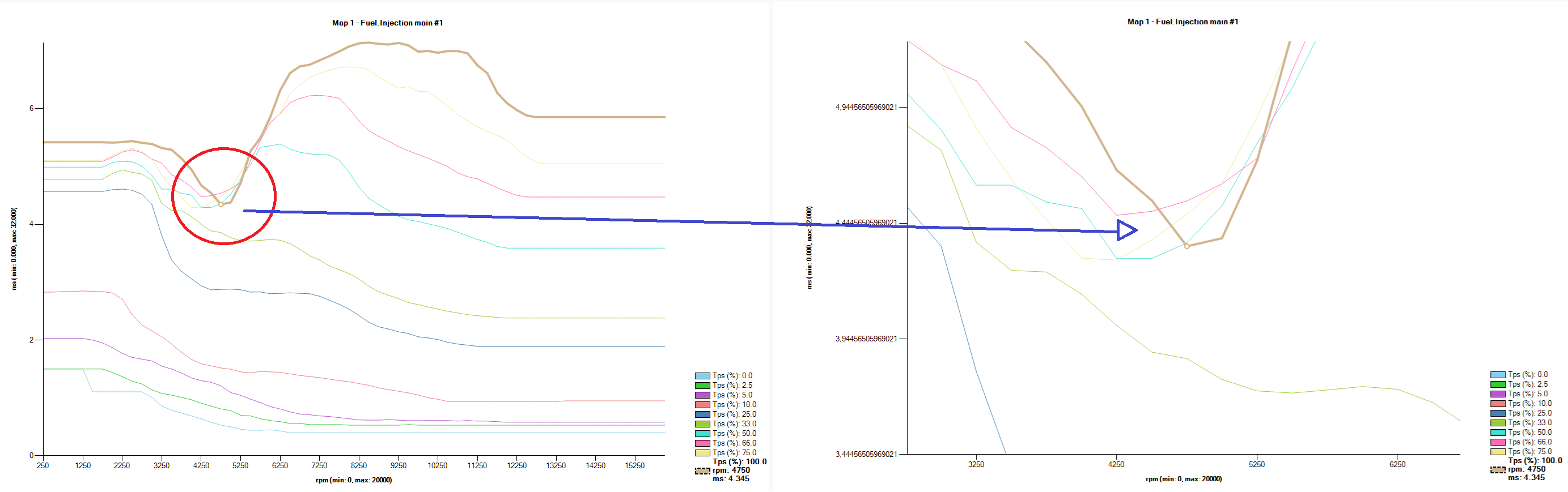
Cell Track
In main and crank tables has been added a pointer that combine the value from DAQ in coordinates values on the table. For example in main table combine TPS and RPM and place the red pointer on the table to identify the zone you want modify as gif above shows you.
Gauge TPS Calibration
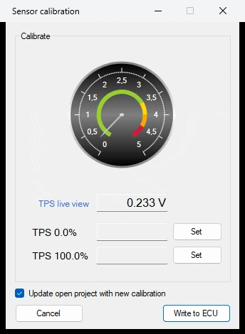
In the sensor calibration window is added a gauge to give you an easier feedback about TPS value.
Add management for T500 ECU
Introduced managment for T500 ECU.